


At the Fraser Health hackathon in January 2017, I met the CEO of QiiQ Healthcare, Dave Brown. I was looking for opportunities to do data visualization at the hackathon, and we got into discussing exciting possibilities for communicating patient tracking metrics to clinicians and administrators for QiiQ. However I wasn’t able to contribute to QiiQ until July, when my contract with Fraser Health ended.
For a week, I performed a loose form of a “design sprint” to create a mobile dashboard for displaying metrics and refining the QiiQ app’s features. The goal was to create a mockup that could be shown to potential users for gathering feedback. With QiiQ Healthcare still in an early phase, learning about what kinds of features clinicians might find useful in an app would be incredibly useful.
First steps
I started working on QiiQ from a low level of familiarity with emergency departments. Despite having worked in healthcare at Fraser Health, I had little contact with emergency departments. Just by reading the website for QiiQ, I could tell I was going to have to learn many terms and metrics before I began designing. Dave familiarized me with terms such as “Door to Doc”, “Left Without Being Seen” (LWBS), and “Length of Stay” (LOS) that are standard across North American emergency departments.
However, different emergency department staff have different needs. Doctors and nurses want to know about their own performance and the health of the patients they’re attending to. Whereas, administrators want to know about the overall status of the department. Each group’s requirements would need to be accommodated in the design, likely by allowing user customization of what metrics are displayed.
Setting Emergency Department Goals
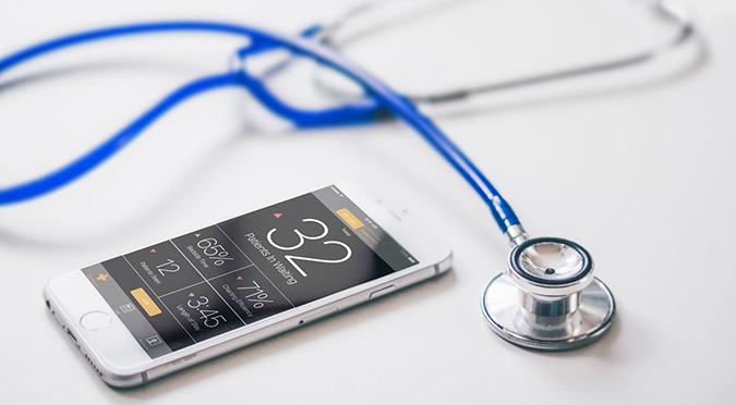
Dave and I directly compared the Fitbit mobile app to what we were trying to achieve with QiiQ, which we both used daily. Its simple dashboard effectively displayed up the minute data, progress towards fitness goals, and it put details only a tap away. If we could get clinicians and administrators to use the QiiQ app to gauge patient progress in the emergency department the way we used the Fitbit app to gauge our own fitness, QiiQ would be a major success.
After a few quick sketches, I realized there was a major difference between QiiQ and Fitbit: fitness goals are about achieving a target, while emergency department goals are about staying under target. Using the same visualization for progress towards calories burned as for patients in the waiting room wouldn’t make sense. I investigated this problem of visualizing goals with further sketching and ideation. I especially liked using Stephen Few’s bullet graph, which could show both goals and progress towards them in a relatively small amount of space.


When Dave and I went over my initial sketches it was clear I still had a long ways to go. Where the Fitbit dashboard has a clear sense of hierarchy and purpose, my focus on goals put an overwhelming amount of data on screen. For administrators that might work. However, clinicians would be too busy with patients in the emergency department to read large amounts of data on screen.
“Fitbit for the Emergency Department”
Dave had now organized a list of metrics, divided into which ones were needed by administrators or by clinicians. The most critical metric for both to watch was patients in waiting. In data visualization, I’ve found that designing the data is as important as designing the visualization. Displaying raw data isn’t necessarily the most useful or interesting thing to visualize. Getting the data right can inspire a much more creative and effective visualization.
My plan was to sketch on paper, then pick the best sketches and revise them on my iPad. This seemed like a good balance of quick sketching and refined designs. I also did more research in the hopes of finding ideas for one eye-catching visualization for patients in waiting. When I went sketching, I found that the iPad’s interface lag and the temptation to tweak things slowed me down too much. I only managed twenty three sketches, which is fairly paltry by my standards.
Of those sketches, Dave thought the one imitating Fitbit was the most appealing, because it shared that same clear hierarchy. But I hadn’t solved the issues with Fitbit goals that I identified earlier. I needed to drop the iPad — it was slowing me down far too much. The right design had to get the clinicians’ dashboard right before moving on to more detailed data screens.


Delving into the QiiQ Dashboard
Before I went on the last round of sketching I looked at every other fitness tracker dashboard to find other ideas I could borrow from. Surprisingly, it was the Nike+ Run Club app that inspired me most. The simple, blunt display of bolded numbers was easily understandable. Showing a number with the change in trend as an arrow hit the sweet spot of showing just enough information to be useful.
To open the design beyond “solve for this dashboard”, I experimented with dropping earlier assumptions about the design. I was tired of grid layouts, which seemed necessary for user customization of the dashboard. I played with bubbles that pop up with the data and angled tabs that could be pulled from the side to reveal data. Weirdly, it led to me playing with different types of lists and icons. Inspiration works in mysterious ways.
When I presented these latest sketches to Dave, he showed them to his clinician contacts, and wasn’t confident about the list of metrics he had come up with earlier. To find out if we needed more or different metrics, I took the best of my sketches and turned them into three higher quality mockups in Adobe Illustrator and Photoshop. These sketches were used in a survey to gather more information about what QiiQ’s potential users would need.


Creating the higher fidelity mockups marked the end of the first design sprint, and I’m now waiting on the results of the survey — and my own availability — to complete a second design sprint.